The Silverlight toolkit comes with Busy Indicator control, but some time you may need to develop custom Busy Indicator for your application. Here are the steps to create Busy Indicator using Silverlight StoryBoard.

Step 1: Create Silverlight Application
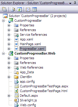
Create Silverlight application and add ProgressBar.xaml user control in your project.

Step 2: Code Progress Bar
Copy and paste below given code ten times and change grid name from circle0 through circle9. This code will be used to generate small filled circles.
<Grid x:Name="circle0" HorizontalAlignment="Center" Margin="0,0,0,0"
VerticalAlignment="Center" Opacity="0" RenderTransformOrigin="0.5,0.5">
<Grid.RenderTransform>
<TransformGroup>
<ScaleTransform />
<SkewTransform />
<RotateTransform />
<TranslateTransform X="29" Y="-44" />
</TransformGroup>
</Grid.RenderTransform>
<Ellipse HorizontalAlignment="Center" Margin="0,0,0,0" Width="10"
RenderTransformOrigin="0.5,0.5" Stroke="{x:Null}" Height="10"
VerticalAlignment="Center">
<Ellipse.Fill>
<RadialGradientBrush>
<GradientStop Color="#FF000000" />
<GradientStop Color="#00000000" Offset="1" />
<GradientStop Color="#7F000000" Offset="0.551" />
</RadialGradientBrush>
</Ellipse.Fill>
<Ellipse.RenderTransform>
<TransformGroup>
<ScaleTransform />
<SkewTransform />
<RotateTransform />
<TranslateTransform X="2" Y="2" />
</TransformGroup>
</Ellipse.RenderTransform>
</Ellipse>
<Ellipse Height="9" HorizontalAlignment="Center" Margin="0,0,0,0"
Width="9" RenderTransformOrigin="0.5,0.5" VerticalAlignment="Center" Stroke="{x:Null}">
<Ellipse.Fill>
<LinearGradientBrush EndPoint="0.5,1" StartPoint="0.5,0">
<GradientStop Color="#FF9ED9E7" />
<GradientStop Color="#FF67BED9" Offset="1" />
</LinearGradientBrush>
</Ellipse.Fill>
<Ellipse.RenderTransform>
<TransformGroup>
<ScaleTransform />
<SkewTransform />
<RotateTransform />
<TranslateTransform X="0" Y="0" />
</TransformGroup>
</Ellipse.RenderTransform>
</Ellipse>
</Grid>
Step 3: Add StoryBoard code
Add this StoryBoard in user control resources section. This will start Busy Indicator animation.
<Storyboard x:Name="StartAnimation">
<DoubleAnimation Storyboard.TargetProperty="(UIElement.Opacity)"
Storyboard.TargetName="LayoutRoot" From="0" To="1" Duration="0:0:0.3">
</DoubleAnimation>
</Storyboard>
Copy and paste below code ten times and change StoryBoard name from ProgressStoryboard0 through ProgressStoryboard9 and StoryBoard TargetName from circle0 through circle9 (you have already declared code for circles above). This code will be used to generate StoryBoard animation for Busy Indicator.
<Storyboard x:Name="ProgressStoryboard0">
<DoubleAnimationUsingKeyFrames BeginTime="00:00:00" Storyboard.TargetName="circle0"
Storyboard.TargetProperty="(UIElement.Opacity)">
<SplineDoubleKeyFrame KeyTime="00:00:00" Value="0" />
<SplineDoubleKeyFrame KeyTime="00:00:00.0050000" Value="1" />
<SplineDoubleKeyFrame KeySpline="0,0,0.601999998092651,0.400999993085861"
KeyTime="00:00:00.7000000" Value="1" />
<SplineDoubleKeyFrame KeyTime="00:00:00.7120000" Value="0" />
</DoubleAnimationUsingKeyFrames>
<DoubleAnimationUsingKeyFrames BeginTime="00:00:00" Storyboard.TargetName="circle0"
Storyboard.TargetProperty="(UIElement.RenderTransform).(TransformGroup.Children)[0].(ScaleTransform.ScaleY)">
<SplineDoubleKeyFrame KeyTime="00:00:00" Value="1" />
<SplineDoubleKeyFrame KeyTime="00:00:00.0050000" Value="1" />
<SplineDoubleKeyFrame KeySpline="0,0,0.601999998092651,0.400999993085861"
KeyTime="00:00:00.7000000" Value="0.3" />
<SplineDoubleKeyFrame KeyTime="00:00:00.7120000" Value="0.30000001192092896" />
</DoubleAnimationUsingKeyFrames>
<DoubleAnimationUsingKeyFrames BeginTime="00:00:00" Storyboard.TargetName="circle0"
Storyboard.TargetProperty="(UIElement.RenderTransform).(TransformGroup.Children)[0].(ScaleTransform.ScaleX)">
<SplineDoubleKeyFrame KeyTime="00:00:00" Value="1" />
<SplineDoubleKeyFrame KeyTime="00:00:00.0050000" Value="1" />
<SplineDoubleKeyFrame KeySpline="0,0,0.601999998092651,0.400999993085861"
KeyTime="00:00:00.7000000" Value="0.3" />
<SplineDoubleKeyFrame KeyTime="00:00:00.7120000" Value="0.30000001192092896" />
</DoubleAnimationUsingKeyFrames>
</Storyboard>
Step 4: Add animation start and stop code
Add below code in your ProgressBar.xaml.cs file. This has a dependency property IsActive. When IsActive is set to true the Busy Indicator animation will start and when it is set to false the animation will be stopped.
public partial class ProgressBar : UserControl
{
private Storyboard storyBoard;
private List<Storyboard> storyBoardList;
private int nextStoryBoard;
public static readonly DependencyProperty IsActiveProperty =
DependencyProperty.Register("IsActive", typeof(bool), typeof(ProgressBar), new PropertyMetadata(IsActivePropertyChanged));
public ProgressBar()
{
InitializeComponent();
this.storyBoard = new Storyboard()
{
Duration = new Duration(TimeSpan.FromMilliseconds(100))
};
this.storyBoard.Completed += new EventHandler(this.OnIntervalTimerCompleted);
this.storyBoardList = new List<Storyboard>()
{
ProgressStoryboard0,
ProgressStoryboard1,
ProgressStoryboard2,
ProgressStoryboard3,
ProgressStoryboard4,
ProgressStoryboard5,
ProgressStoryboard6,
ProgressStoryboard7,
ProgressStoryboard8,
ProgressStoryboard9
};
}
public bool IsActive
{
get { return (bool)GetValue(IsActiveProperty); }
set { SetValue(IsActiveProperty, value); }
}
private static void IsActivePropertyChanged(DependencyObject sender, DependencyPropertyChangedEventArgs e)
{
var spinControl = sender as ProgressBar;
if (spinControl != null)
{
if ((bool)e.NewValue)
{
spinControl.Start();
}
else
{
spinControl.Stop();
}
}
}
private void Start()
{
this.Visibility = Visibility.Visible;
StartAnimation.Begin();
this.storyBoard.Begin();
}
private void Stop()
{
this.Visibility = Visibility.Collapsed;
StartAnimation.Stop();
this.nextStoryBoard = 0;
this.storyBoard.Stop();
foreach (var item in this.storyBoardList)
{
item.Stop();
}
}
private void OnIntervalTimerCompleted(object sender, EventArgs e)
{
this.storyBoardList[nextStoryBoard].Begin();
this.nextStoryBoard = this.nextStoryBoard > 8 ? 0 : this.nextStoryBoard + 1;
this.storyBoard.Begin();
}
}
At this point you have completed coding for BusyIndicator control. Now the next step is implementation to see how exactly it works.
Step 5: Implementing Busy Indicator
To implement and test the above mentioned Busy Indicator, I have added a simple WCF MathService which returns sum of two values supplied to its Add method. The main reason behind choosing WCF service for this example is, this is the most common scenario to implement Busy Indicator. Add service reference of this service into Silverlight project.MainPage.xaml changes:
Add namespace for Busy Indicator in MainPage.xaml file.
xmlns:progressBar="clr-namespace:CustomProgressBar"
And add below code in the same file.
<Grid x:Name="LayoutRoot" Margin="20,20,20,20">
<Grid Margin="5,5,5,5">
<StackPanel HorizontalAlignment="Center">
<TextBlock x:Name="lblResult" />
<Button x:Name="btnAdd" Width="100" Content="Add" Click="btnAdd_Click" />
</StackPanel>
</Grid>
<progressBar:ProgressBar x:Name="ProgressBar1" Visibility="Collapsed"/>
</Grid>
You can see in above code, I have placed custom Busy Indicator control in MainPage using below line of code.
<progressBar:ProgressBar x:Name="ProgressBar1" Visibility="Collapsed"/>
MainPage.xaml.cs change: Add below code in this file.
private void btnAdd_Click(object sender, RoutedEventArgs e)
{
ProgressBar1.IsActive = true;
MathService.MathServiceClient proxy = new CustomProgressBar.MathService.MathServiceClient();
proxy.AddCompleted += new EventHandler<CustomProgressBar.MathService.AddCompletedEventArgs>(proxy_AddCompleted);
proxy.AddAsync(10, 10);
}
void proxy_AddCompleted(object sender, CustomProgressBar.MathService.AddCompletedEventArgs e)
{
lblResult.Text = e.Result.ToString();
ProgressBar1.IsActive = false;
}
Here I have added a button with the name "Add", on click of this button I am calling MathService to calculate sum of two given numbers. Once the result is returned from MathService it will be displayed in TextBlock. On button click event I am setting Progress Bar IsActive property to true, at this moment the Busy Indicator animation will start. And when the Add method completed event is called I am setting IsActive property value to false, to stop the animation.
Step 6: Run the application
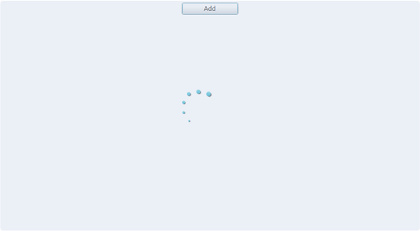
Once all the changes are completed run the application. You will see below screen when you click on "Add" button. The good thing is, until the Busy Indicator runs the UI portion of the application will be locked and once the processing is completed screen will be unlocked again.

HostForLIFE.eu Silverlight 6 Hosting
HostForLIFE.eu is European Windows Hosting Provider which focuses on Windows Platform only. We deliver on-demand hosting solutions including Shared hosting, Reseller Hosting, Cloud Hosting, Dedicated Servers, and IT as a Service for companies of all sizes. We have customers from around the globe, spread across every continent. We serve the hosting needs of the business and professional, government and nonprofit, entertainment and personal use market segments.
