European Silverlight 4 & Silverlight 5 Hosting BLOG

BLOG about Silverlight 5 Hosting and Its Techologies - Dedicated to European Windows Hosting Customer

European Silverlight 5 Hosting - UK :: Style Setters with Silverlight 5

clock November 17, 2014 07:12 by author Scott

One of new Silverlight 5 feature is Style Setter. This great feature was heavily missing from the earlier Silverlight version. The functionality is pretty useful and is extensively used in WPF applications.

Implementing MVVM scenarios with controls inherited from ItemsControls is not an easy way and sometimes may require a lot of work.

Say binding IsSelected on C1TreeView or binding GroupName/HeaderBackground in C1Menu. There are lot of workarounds to these scenarios.

Setting binding in Style Setters is really helpful in these scenarios and it does reduces a lot of work.

Lets see this by an example. Below are the simple classes that we will be using for binding purposes:-

public class Parent
  {
    public string Name{get;set;}
    public List<Child> Childs{get;set;}
    public bool IsSelected { get; set; }
  } 

 public class Child
  {
   public Child(string name)
    {
     this.Name=name;
    }
   public string Name{get;set;}
   public bool IsSelected { get; set; }
  }

Lets populate the collection in our ViewModel:-

public class MyViewModel
  {
   private List<Parent> _collections;
   public MyViewModel()
    {
     _collections = new List<Parent>();
     _collections.Add(new Parent() { Name = "P1", Childs = new List<Child>() { new Child("C11"){IsSelected=true} , new Child("C12"), new Child("C13") } });
     _collections.Add(new Parent() { Name = "P2", IsSelected=true, Childs = new List<Child>() { new Child("C21"), new Child("C22"), new Child("C23") } });
     _collections.Add(new Parent() { Name = "P3", Childs = new List<Child>() { new Child("C31"), new Child("C32"), new Child("C33") } });
     } 

   public List<Parent> Collections
     {
      get
        {
         return _collections;
        }
      }
    }

Next is important xaml that shows the entire binding stuff in xaml:-

<c1:C1TreeView ItemsSource="{Binding Collections}" Grid.Row="1">
 <c1:C1TreeView.ItemTemplate>
 <c1:C1HierarchicalDataTemplate ItemsSource="{Binding Childs}">
 <TextBlock HorizontalAlignment="Stretch" Margin="2" Text="{Binding Name}"/>
 </c1:C1HierarchicalDataTemplate>
 </c1:C1TreeView.ItemTemplate>
<c1:C1TreeView.ItemContainerStyle>
 <Style TargetType="c1:C1TreeViewItem">
 <Setter    Property="IsSelected" Value="{Binding IsSelected}"/>
 </Style>
 </c1:C1TreeView.ItemContainerStyle>
</c1:C1TreeView>

As you can see from the above xaml code, we have used the ItemContainerStyle and bound theIsSelected property on the C1TreeViewItem with the IsSelected property exposed on our class. That was pretty simple. Isnt It?

With earlier versions, you may have to use some helper classes like SetterValueBindingHelper to achieve the same thing.

You can set similar type of styles to most of the controls inherited from ItemsControl like C1Menu,C1Accordion, C1Book etc.  while still obeying the rules of standard MVVM.

The things doesn’t stop here. With this new feature, its pretty easy to bind the C1DataGrid’s row /cell background/foreground/fontweight etc. all in xaml without manually setting the properties in code. See below xaml code which binds the IsAvailable property on the bound item toDataGridRowPresenters Background/Fontweight:-

<Style x:Key="myrowstyle" TargetType="c1:DataGridRowPresenter">
 <Setter  Property="Background" Value="{Binding RelativeSource={RelativeSource Self}, Path=Row.DataItem.IsAvailable, Converter={StaticResource BackgroundConverter}}"/>
 <Setter  Property="FontSize"  Value="{Binding RelativeSource={RelativeSource Self}, Path=Row.DataItem.IsAvailable, Converter={StaticResource FontweightConverter}}"/>
 </Style>


European Silverlight 5 Hosting – HostForLIFE.eu :: Tips - The Easiest way to Reading URL-Parameters in Silverlight

clock August 15, 2014 08:38 by author Onit

In this guide we will showed you how to read the URL-Parameters in Silverlight this article will showed you the easiest way to read it. In CRM there is a setting that you can “pass-param”. If you are on a CRM Form you get keys like “typename” and “id”.

Below is the Complete list of CRM:

Parameter

Name

Description

typename

Entity Name

Name of the entity

type

Entity Type Code

Integer that uniquely identifies the entity in a specific organization

id

Object GUID

GUID that represents a record.

orgname

Organization Name

Unique name of the organization.

userlcid

User Language Code

Language code identifier that is being used by the current user.

orglcid

Organization Language Code

Language code identifier that represents the base language for the organization.


For Example is like

[something].aspx?id=%7bB2232821-A775-DF11-8DD1-00155DBA3809%7d&orglcid=1033&orgname=adventureworkscycle&type=1&typename=account&userlcid=1033

If you have the Silverlight in the Sitemap you don’t get (of course), typename, type and id. You can read them in your Silverlight:

IDictionary<string, string> QueryString = HtmlPage.Document.QueryString;
 string orgname, entityname;

 if (QueryString.ContainsKey("orgname"))
     orgname = QueryString["orgname"];

 if (QueryString.ContainsKey("typename"))
     entityname = QueryString["typename"];


European Silverlight 5 Hosting – HostForLIFE.eu :: How to Create Multi-Click Event in Silverlight 5

clock August 6, 2014 07:22 by author Onit

Silverlight 5 has given us a new property in the MouseButtonEventArgs called Click Count. Before the release of this Silverlight 5, there are no implementation of “double click” event, you need to write your code to implement that. But instead of giving double click event, the Silverlight gave us the ability to tracking how much clicking we done. But there’s a limitation of the clickcount, and in this article will look at creating a solution to resolve it.

Implement ClickCount

For this post we will be using a simple test harness that look like this:

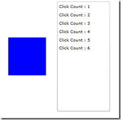
The blue box on the left is going to be our click area.  The right side is a simple ListBox with the ItemsSource set to an ObservableCollection<string>.  And here is what the XAML looks like:

<Grid x:Name="LayoutRoot" Background="White">
    <Grid.ColumnDefinitions>
        <ColumnDefinition/>
        <ColumnDefinition/>
    </Grid.ColumnDefinitions>
       
    <Rectangle Fill="Blue"
               Width="100"
               Height="100"
               VerticalAlignment="Center"
               HorizontalAlignment="Center"/>
       
    <ListBox x:Name="lbClicks"
             Margin="5,5,5,5"
             HorizontalAlignment="Stretch"
             VerticalAlignment="Stretch"
             Grid.Column="1"/>
</Grid>

You can use the code below for the code behind that xaml

private ObservableCollection<string> _events =
             new ObservableCollection<string>();
public MainPage()
{
    InitializeComponent();
    lbClicks.ItemsSource = _events;
}

look at the first example. To track the ClickCount we need to add the MouseLeftButtonDown event. Add the code below to our rectangle in XAML:

<Rectangle Fill="Blue"
            Width="100"
            Height="100"
            VerticalAlignment="Center"
            HorizontalAlignment="Center"         
MouseLeftButtonDown="Rectangle_MouseLeftButtonDown"/>

In our event handler, we can easily track the click count by adding a new string to our _events collection.  You will notice that the ClickCount will increase each time you click the mouse button if you are quick enough.  Pause in the clicking for a moment and the ClickCount will reset!.

private void Rectangle_MouseLeftButtonDown(object sender,
                                  MouseButtonEventArgs e)
{
       _events.Add("Click Count : " + e.ClickCount);
}

You can see that we can track a double click or triple click or a click-15 if we want.
All we would need to add is a conditional statement based off of the ClickCount property.

if(e.ClickCount == 2)

{
  MessageBox.Show("Double click");
}

Issue

however, While this is an interesting solution for the missing functionality, it does have a missing component that will cause you some grief.  Instead of our conditional statement that we had above, what if our code looked something like this:

if(e.ClickCount == 1)
{
  MessageBox.Show("Single click");
}
else if(e.ClickCount == 2)
{
  MessageBox.Show("Double click");}
}

If you run this code, you will notice that you will never fire the “Double click” MessageBox.  This is because the moment the first MessageBox is displayed, the focus is taken away from our rectangle and thus the ClickCount is started over when we come back to it.  This means that attempting to implement two events is a bit tricky.

How to make it worked!

So How to track multiple click?  You need to write some code.  In order to create a reusable solutionwe decide to implement solution as a behavior.  This will allow us to add a multiple click handler to any UIElement in XAML without having to do a bunch of wiring.  However, the code is straight forward enough you can easily remove it and create your own reusable solution.

Every time a user clicks on your object a DispatcherTimer is stopped and then started.  In addition we track the latest sender object and the ClickCount.  Once the user stops clicking on your object, the DispatcherTimer is allowed to hit the Click event and we fire an event giving the latest ClickCount and the sending object.

Our code for the behavior will looks like this:
public class MultiClick : Behavior<UIElement>

{
    private DispatcherTimer _timer;
    private int _clickCount;
    private object _sender;

    public MultiClick()
    {
        _timer = new DispatcherTimer()
             {Interval = new TimeSpan(0, 0, 0, 0, 250)};
        _timer.Tick += _timer_Tick;
    }

    #region events and delegates

    public delegate void MouseMultiClickHandler(object sender,
                                              int clickCount);
    public event MouseMultiClickHandler MouseMultiClick;

    #endregion

    #region Behavior Overrides
    protected override void OnAttached()
    {
        base.OnAttached();
        AssociatedObject.MouseLeftButtonDown
        += AssociatedObject_MouseLeftButtonDown;
    }

    protected override void OnDetaching()
    {
        base.OnDetaching();
        AssociatedObject.MouseLeftButtonDown
        -= AssociatedObject_MouseLeftButtonDown;
    }
    #endregion

    #region EventHandlers

    void _timer_Tick(object sender, EventArgs e)
    {
        _timer.Stop();

        if (MouseMultiClick != null)
            MouseMultiClick(_sender, _clickCount);
    }

    void AssociatedObject_MouseLeftButtonDown(object sender,
                                   MouseButtonEventArgs e)
    {
        _timer.Stop();
        _clickCount = e.ClickCount;
        _sender = sender;
        _timer.Start();

    }

    #endregion

}

The OnAttached/OnDetaching methods are how the Behavior is attached to the object, an UIElement is our case.  The AssociatedObject is simply to object that the Behavior is attached to.  As we discussed before, the DispatcherTimer is stopped and started when the user clicks on the object.  Once the DispatcherTimer hits the Click event, it(dispatcher time) will stop stopped, a MouseMultiClick event is fired and the Behavior waits for the next MouseLeftButtonDown event.

**Note: Its important to set the time at 200 milliseconds. And no longer than that you may get unexpected results.

This is how we use our behavior, Here is what are Rectangle looks like with our Behavior.  I have also removed the MouseLeftButtonDown event.

<Rectangle Fill="Blue"
            Width="100"
            Height="100"
            VerticalAlignment="Center"
            HorizontalAlignment="Center">
    <i:Interaction.Behaviors>
        <local:MultiClick MouseMultiClick="MultiClick_MouseMultiClick"/>
    </i:Interaction.Behaviors>
</Rectangle>

You can see we attached to the MouseMultiClick event we created in our Behavior.  The code behind is pretty much identical to our original code behind, where we are simply tracking the event:

private void MultiClick_MouseMultiClick(object sender,
                                       int clickCount)
{
    _events.Add("Multi Click : " + clickCount);
}
  If you run the project again, you will now see that instead of getting an event for every click, you only get one event for each round of clicking.  So you can track single, double, triple, etc.  From there you can implement your code based on your project needs.


European Silverlight 5 Hosting - Amsterdam :: Using MVVM to Show Busy Indicator in Silverlight

clock February 25, 2013 05:05 by author Scott

Introduction

When using Silverlight, everything is asynchronous. It seems to be the trend, the same goes for Windows 8. This means that you will need to inform the user about progress in the background.

Silverlight uses the BusyIndicator for this behavior. Using MVVM, it might be a bit harder to implement the BusyIndicator in a correct way, but Catel provides the IPleaseWaitService for years which can be mocked easily during test scenarios.

However, it didn’t support a busy indicator per view yet. This fact has changed today, as you can see in the screenshot below:

A long requested feature in Catel was the support for tags in the ServiceLocator. The ServiceLocator is the IoC solution that Catel provides by default. A customer of Catel recently required the busy indicators to show up per view. I thought a bit about it and this could be solved by the recently (read: this week) introduction of the tags in the ServiceLocator.

Setting up the views

The view is responsible for registering the service. This can easily be done using the Catel user controls. Create a view like you always do, then use the following code-behind:

   1:  protected override void OnViewModelChanged()
   2:  {
   3:      var serviceLocator = ServiceLocator.Default;
   4:  
   5:      var viewModel = ViewModel;
   6:      if (viewModel != null)
   7:      {
   8:          serviceLocator.RegisterInstance(typeof (IPleaseWaitService), new PleaseWaitService(this), viewModel);
   9:      }
  10:  }

This code will be executed when the ViewModel property of the control changes. The view registers a view specific instance of the PleaseWaitService service in the ServiceLocator. It uses the new view model as tag so that will be used to distinguish the services.

Setting up the view models

The view model can retrieve the PleaseWaitService very easily because the tag is itself. To show the view specific please wait service, use this code:

   1:  var pleaseWaitService = GetService<IPleaseWaitService>(this);
   2:  pleaseWaitService.Show();

To hide the window again, use this code:

   1:  var pleaseWaitService = GetService<IPleaseWaitService>(this);
   2:  pleaseWaitService.Hide();

Customizing the PleaseWaitService

Customizing the please wait service is very, very easy. Just override the class like this:

   1:  public class MyCustomPleaseWaitService : PleaseWaitService
   2:  {
   3:      protected override FrameworkElement CreateBusyIndicator()
   4:      {
   5:          var busyIndicator = new MyBusyIndicatorControl();
   6:          
   7:          busyIndicator.SetBinding(System.Windows.Controls.BusyIndicator.BusyContentProperty, new Binding("Status"));
   8:          busyIndicator.SetBinding(System.Windows.Controls.BusyIndicator.IsBusyProperty, new Binding("IsBusy"));
   9:          
  10:          return busyIndicator();
  11:      }
  12:  }

The base implementation will automatically take care that the data context is updated and that the control is centered as required.


European Silverlight Hosting - Amsterdam :: Silverlight FluentDataGrid

clock January 24, 2013 07:14 by author Scott

Almost every application to work with the data we have to work with the tables for display to the user of any data which it has applied. For users familiar applications such pages and comfortable enough, but not always easy to implement a particular display logic for complex data structures such as the customer wants them to be. We give a simple example, let us have the lists A and B, are related by 1: n, each element of the list B contains three attributes - the key, the record type and value, types of records that can be repeated. Suppose we want to display the record of A, so that each row of A list displays all values ​​from the list B, the record type is used as a title 

Students (List A) 

Id

Name

1

John

2

Alex

3

Sara

Marks (List B) 

Id

Student

Category

Value

1

1

C#

5

2

1

Java

3

1

HTML & CSS

4

4

2

C#

4

5

3

Java

3

We need to get the following table:

Id

Name

Marks

C#

Java

HTML & CSS

1

John

5

4

4

2

Alex

4

-

-

3

Sara

-

3

-

Application in which I faced with such a task was developed using the technology of Silverlight. Built-in DataGrid functionality described above is not realized. This led to the development of special control FluentGrid. 

How it works:

FluentDataGrid - is the control that builds a table based on a custom data source FluentGridSource. Currently, the construction of the table (view) is available only at runtime. FluentGridSource has Fluent-like interface for the formation of rules of construction.

The key source of data is the formation of the class, which will be a "model line." She describes one row of the result table, for our example of such a class might look like:

public class ExampleRow : PropertyChangedBase
{
    public ExampleRow(int id, string name, IList<IDynamicElement> marks)
    {
        _id = id;
        _name = name;
        Marks = marks;
    }

    private int _id;
    private string _name;

    [DynamicHeader("Id", false, HorizontalAlignment = HorizontalAlignment.Right)]
    public int Id
    {
        get { return _id; }
        set
        {
            NotifyPropertyChanged(() => Id);
            _id = value;
        }
    }

    [DynamicHeader("Name", false,
        HorizontalAlignment = HorizontalAlignment.Left, Width = 200)]
    public string Name
    {
        get { return _name; }
        set
        {
            NotifyPropertyChanged(() => Name);
            _name = value;
        }
    }

    public IList<IDynamicElement> Marks { get; set; }
}

public class MarkDynamicElement : PropertyChangedBase, IdynamicElement
{
    private object _value;

    public MarkDynamicElement(DynamicHeader header, object value)
    {
        Header = header;
        Value = value;
    }

    /// <summary>
    /// Header for the value
    /// </summary>
    public DynamicHeader Header { get; set; }

    /// <summary>
    /// Value that will be displayed
    /// </summary>
    public object Value
    {
        get { return _value; }
        set
        {
            _value = value;
            NotifyPropertyChanged(() => Value);
        }
    }
}

The base class implements the INotifyPropertyChanged PropertyChangedBase. We see that in the line two "static" column Id and Name, attribute DynamicHeader helps us set a cap column. There is also a list of Marks, a "dynamic" of the table, which can be constructed, for example, by using LINQ. Its elements have to implement a special interface IDynamicElement.

In forming a data source, you can add formatting rules AddFromatter (), totals AddSummary (), validation rules for totals AddValidator (), the validation rules of values ​​in table cells AddCellValidator (), and set rules for the formation of the hierarchy. In order to specify the hierarchy, you must specify the property model - key (Id), the property - a reference to the parent element (ParentId) and the property on which to display the hierarchy. 

How to use:  

The first step is defining the control in the XAML file:  

<CurriculumControl Source="{Binding SimpleSampleSource,Mode=TwoWay}" SelectedItem="{Binding SelectedRow, Mode=TwoWay}" /> 

Next step is to create a row with the appropriate attributes for the grid as described above. 

Than you should create view model, construct FluentGridSource

DynamicExampleSource = FluentGridSource.CreateFrom(DynamicExampleSource, Repository.GetExampleRows());
Constructing FluentGrisSource may be more complex if you set some validation, totals
ValidationSampleSource = new FluentGridSource(typeof(SimpleRow));
ValidationSampleSource = FluentGridSource.CreateFrom(ValidationSampleSource, Repository.GetSimpleRows());

#region Formatters

ValidationSampleSource
    .SetOptions(true, 50)
    .AddFormatter(new DynamicHeader {Name = "Min", HeaderGroup = new OverallSalaryHeaderGroup()},
                  (row, value) => ((double) value).ToString("c", new CultureInfo("en-us")));
#endregion

#region Summaries
ValidationSampleSource
    .AddSummary(new DynamicHeaderCollection {new DynamicHeader {Name = "Employee name"}}, x => "Total")
    .AddSummary(
        new DynamicHeaderCollection
            {new DynamicHeader {Name = "Min", HeaderGroup = new OverallSalaryHeaderGroup()}},
        delegate(IDictionary<DynamicHeader, IEnumerable> allValues)
            {
                var header = allValues.Keys.Single(x => x.Name == "Min");
                var values = (List<object>) allValues[header];
                return values.Sum(x => (double) x);
            })
    .AddSummary(
        new DynamicHeaderCollection
            {new DynamicHeader {Name = "Max", HeaderGroup = new OverallSalaryHeaderGroup()}},
        delegate(IDictionary<DynamicHeader, IEnumerable> allValues)
            {
                var header = allValues.Keys.Single(x => x.Name == "Max");
                var values = (List<object>) allValues[header];
                return values.Sum(x => (double) x);
            });
#endregion

#region Validations

ValidationSampleSource
    .AddCellValidator(new DynamicHeader { Name = "Min", HeaderGroup = new OverallSalaryHeaderGroup() },
        delegate(object row, object value)
        {
            var simpleRow = (SimpleRow)row;
            var min = (double)value;

            if (min > simpleRow.Max)
                return "Minimum cannot be higher than maximum!";
            if (min < 5000)
                return "Minimum cannot be lower than $5000";

            return null;
        })
    .AddCellValidator(new DynamicHeader { Name = "Max", HeaderGroup = new OverallSalaryHeaderGroup() },
        delegate(object row, object value)
        {
            var simpleRow = (SimpleRow)row;
            var max = (double)value;

            if (max < simpleRow.Min)
                return "Maximum cannot be lower than minimum!";
            if (max > 500000)
                return "Maximum cannot be heigher than $500000";

            return null;
        });

#endregion


European Silverlight 5 Hosting - Amsterdam :: Working with Observable Collections in Silverlight 5

clock November 15, 2012 09:49 by author Scott

Observable Collections are great to preserve the latest data in data controls without having to rebind data to the data controls. In this article we will explore how we can work with Observable Collections in Silverlight 5.

Silverlight – A Quick Look

Silverlight is a browser plug-in that promotes a collaborative development environment of rich online media content that enables developers and designers alike to integrate multimedia and graphics into web pages within the context of the managed environment. Over the past few years, Silverlight, formerly known as Windows Presentation Foundation Everywhere (WPF/E), has become popular worldwide for developing the next generation of cross-browser, cross-platform Rich Internet Applications (RIAs).

Observable Collections

The generic List<T> represents a strongly typed list of elements or a CLR or non-CLR type. When we bind data to a DataControl in ASP.NET using such a list, the data in the data bound control is up to date with the data in the list. However, when the data in the list changes, the data control has to be re-bound to reflect the changes. In other words, we have to rebind the data in the list (now the list contains updated data) to reflect the change. This problem is solved in using ObservableCollection<T>. This collection is capable of providing notifications of items added/deleted/edited through the INotifyCollectionChanged interface. The INotifyCollectionChanged interface has an event called PropertyChanged, which is fired when a property value is changed.

ObservableCollection is a generic dynamic data structure that has the ability to send notifications when items are added, removed or when the collection is refreshed. The MSDN states: "Represents a dynamic data collection that provides notifications when items get added, removed, or when the whole list is refreshed." Reference: http://msdn.microsoft.com/en-us/library/ms668604.aspx

The ObservableCollection class is shown below:

[SerializableAttribute]
public class ObservableCollection<T> : Collection<T>,
            INotifyCollectionChanged, INotifyPropertyChanged


You can instantiate an Observable collection as shown in the code snippet below:

using System.Collections.ObjectModel;
ObservableCollection<Product> products = new ObservableCollection<Product>();

Consider the following class:

public class Contact
    {
        private string firstName;
        private string lastName;
        private string address; 

        public Contact(string firstName, string lastName, string address)
        {
            this.firstName = firstName;
            this.lastName = lastName;
            this.address = address;
        } 

        public string FirstName
        {
            get { return firstName; }
            set { firstName = value; }
        } 

        public string LastName
        {
            get { return lastName; }
            set { lastName = value; }
        } 

        public string Address
        {
            get { return address; }
            set { address = value; }
        }
    }

The following class creates an Observable Collection out of the Contact class:

public class EmployeeList : ObservableCollection<Contact>
    {
        public EmployeeList()
            : base()
        {
            Add(new Contact("Joydip", "Kanjilal", "Hyderabad"));
            Add(new Contact("Debanjan", "Banerjee", "Kolkata"));
            Add(new Contact("Shaik", "Tajuddin","Hyderabad"));
            Add(new Contact("Firdous", "Khan", "Hyderabad"));
        }
    }

You can now use the Observable Collection you have created to bind data to a Silverlight Data Grid. Here is how the mark-up code would look:

<Grid x:Name="LayoutRoot" Background="White">
        <sdk:DataGrid x:Name="dgData" Grid.Row="2" AutoGenerateColumns="True"  ItemsSource="{Binding Source}" >

        </sdk:DataGrid>
    </Grid>

And, here's the code you would write to bind data to the DataGrid control named dgData:

public partial class MainPage : UserControl
    {
        EmployeeList empList = new EmployeeList();

        public MainPage()
        {
            InitializeComponent();          

            dgData.ItemsSource = empList;

        }
    }

To ensure that the DataGrid is refreshed if any item in the collection is changed, we should take advantage of the PropertyChangedEventHandler event handler. The NotifyPropertyChange event handler would be automatically called whenever the list is changed.

public partial class MainPage : UserControl
    {
        EmployeeList empList = new EmployeeList();

        public MainPage()
        {
            InitializeComponent();          
            dgData.ItemsSource = empList;

        }

        public EmployeeList Data
        {

            get { return empList; }

            set
            {

                empList = value;

                NotifyPropertyChange("empList");

            }

        }

        public event PropertyChangedEventHandler PropertyChanged;

        protected void NotifyPropertyChange(string propertyName)
        {

            if (PropertyChanged != null)
                PropertyChanged(this, new PropertyChangedEventArgs(propertyName));

        }
    }

Summary

In this article we discussed how we can work with Observable Collections in Silverlight 5. We explored Observable Collections, why they are helpful and how we can bind data to data controls in Silverlight using Observable Collections. Happy reading!


European Silverlight 5 Hosting - Amsterdam :: Creating a Silverlight 5 Static Markup Extension

clock August 28, 2012 10:00 by author Scott

If you have done any WPF application development I am sure you have used and fallen in love with the Static markup extension. If you’re are not familiar with it, the Static markup extension allows you to reference static fields and properties in your XAML markup.

For example; let’s assume we have a class with the following static field defined:


public class Common

 {
     public static string StaticText = "This is text from a static property";
 }

We can use this field in our WPF application as follows:

<Grid>

     <TextBlock Text="{x:Static ext:Common.StaticText}" />
 </Grid>


NOTE: “ext” is a namespace that has been defined to instruct the XAML parser where to find our static field.

Pretty cool right? Unfortunately if you are also doing any Silverlight development you will soon find that this wonderful and useful extension does NOT exist in Silverlight. Luckily for us in Silverlight 5 we were given the ability to write our own custom markup extensions. This can be done using either the
IMarkupExtension or the abstract MarkupExtension class.

Now it’s time to create our own Static markup extension. I want to point out that there is a naming convention when creating custom markup extensions. The convention is as follows; ExtensionNameExtension. The name of the extension is followed by Extension. This is very similar to how you create attributes. You won’t actually be using the suffix when define them in XAML.

Let’s start by creating a new class called StaticExtension. The StaticExtension class should derive from the MarkupExtension abstract class. You will need to implement the abstract ProvideValue method. The code I used for the Static markup extension is as follows.

/// <summary>
 ///  Class for Xaml markup extension for static field and property references.
 /// </summary>
public class StaticExtension : MarkupExtension
 {
     /// <summary>
     ///  The static field or property represented by a string.  This string is
     ///  of the format Prefix:ClassName.FieldOrPropertyName.  The Prefix is
    ///  optional, and refers to the XML prefix in a Xaml file.
     /// </summary>
    private string _member;
     public string Member
     {
         get { return _member; }
         set
         {
             if (value == null)
             {
                 throw new ArgumentNullException("Member");
             }
             _member = value;
         }
     }

    /// <summary>
     ///  Return an object that should be set on the targetObject's targetProperty
    ///  for this markup extension.  For a StaticExtension this is a static field
    ///  or property value.
     /// </summary>
    /// <param name="serviceProvider">Object that can provide services for the markup extension.
     /// <returns>
     ///  The object to set on this property.
     /// </returns>
    public override object ProvideValue(IServiceProvider serviceProvider)
     {
         if (_member == null)
             throw new InvalidOperationException("member cannot be null");

        // Validate the _member
        int dotIndex = _member.IndexOf('.');
         if (dotIndex < 0)
             throw new ArgumentException("dotIndex");

        // Pull out the type substring (this will include any XML prefix, e.g. "av:Button")
        string typeString = _member.Substring(0, dotIndex);
         if (typeString == string.Empty)
             throw new ArgumentException("typeString");

        // Get the IXamlTypeResolver from the service provider
         IXamlTypeResolver xamlTypeResolver = serviceProvider.GetService(typeof(IXamlTypeResolver)) as IXamlTypeResolver;
         if (xamlTypeResolver == null)
             throw new ArgumentException("xamlTypeResolver");

        // Use the type resolver to get a Type instance
        Type type = xamlTypeResolver.Resolve(typeString);

        // Get the member name substring
         string fieldString = _member.Substring(dotIndex + 1, _member.Length – dotIndex – 1);
         if (fieldString == string.Empty)
             throw new ArgumentException("fieldString");

        // Use the built-in parser for enum types
         if (type.IsEnum)
         {
             return Enum.Parse(type, fieldString, true);
         }

        // For other types, reflect
        bool found = false;
         object value = null;

        object fieldOrProp = type.GetField(fieldString, BindingFlags.Public |                                                         BindingFlags.FlattenHierarchy | BindingFlags.Static);
         if (fieldOrProp == null)
         {
             fieldOrProp = type.GetProperty(fieldString, BindingFlags.Public
|                                                         BindingFlags.FlattenHierarchy | BindingFlags.Static);
             if (fieldOrProp is PropertyInfo)
             {
                 value = ((PropertyInfo)fieldOrProp).GetValue(null, null);
                 found = true;
             }
         }
         else if (fieldOrProp is FieldInfo)
         {
             value = ((FieldInfo)fieldOrProp).GetValue(null);
             found = true;
         }

        if (found)
             return value;
         else
             throw new ArgumentException("not found");
     }
 }

Now all I need to do is add a namespace to my Silverlight view and then use it in XAML as follows:

<Grid x:Name="LayoutRoot" Background="White">

     <TextBlock Text="{ext:Static Member=ext:Common.StaticText}" />
 </Grid>


That’s it! I will definitely be using this quite often. I would like to mention that unlike in WPF where you don’t have to specify the “Member” property explicitly, in Silveright you have to explicitly set the Member property. This is because there is not a
ConstructorArgument attribute in Silverlight. So until then you will need to have a little extra text in your markup syntax.


European Silverlight 5 Hosting - Amsterdam :: Implicit Data Templates in Silverlight 5

clock May 29, 2012 08:43 by author Scott

One of the powerful new features around templating in the Silverlight 5 beta is the ability to produce a DataTemplate that will be implicitly associated with a particular data type.

For example, if I have these 2 simple types Person and Vehicle;


public class Person  
{  
  public string FirstName { get; set; }  
  public string LastName { get; set; }  
  public int Age { get; set; }  
}  
public class Vehicle  
{  
  public string Type { get; set; }  
  public int Wheels { get; set; }  
}
 

then I can define implicit templates for them by writing templates such as these;


<UserControl.Resources> 
    <DataTemplate 
      DataType="local:Person"> 
      <StackPanel> 
        <TextBlock 
          Text="{Binding FirstName}" /> 
        <TextBlock 
          Text="{Binding LastName}" /> 
        <TextBlock 
          Text="{Binding Age}" /> 
      </StackPanel> 
    </DataTemplate> 
    <DataTemplate 
      DataType="local:Vehicle"> 
      <StackPanel> 
        <TextBlock 
          Text="{Binding Type}" /> 
        <TextBlock 
          Text="{Binding Wheels}" /> 
      </StackPanel> 
    </DataTemplate> 
  </UserControl.Resources>
 

where I have not specified a
Key for these resources but have, instead, specified a DataType and that’s enough for Silverlight to figure it out.

If I have a scenario like this one where I have a
ListBox bound to a set of Items;

<Grid>  
  <Grid.RowDefinitions>  
    <RowDefinition />  
    <RowDefinition  
      Height="Auto" />  
    <RowDefinition  
      Height="Auto" />  
  </Grid.RowDefinitions>  
  <ListBox  
    ItemsSource="{Binding Items}">  
  </ListBox>  
  <Button  
    Command="{Binding AddPerson}" 
    Content="Add Person" 
    Grid.Row="1" />  
  <Button  
    Command="{Binding AddVehicle}" 
    Content="Add Vehicle" 
    Grid.Row="2" />  
</Grid> 


with a
DataContext providing a view model like this one;

public class ViewModel  
{  
  public ViewModel()  
  {  
    this.Items = new ObservableCollection<object>();  
    this.AddPerson = new SimpleCommand(() =>  
      {  
        this.Items.Add(  
          new Person()  
          {  
            FirstName = "TestFirst",  
            LastName = "TestLast",  
            Age = 22  
          });  
      });  
    this.AddVehicle = new SimpleCommand(() =>  
      {  
        this.Items.Add(  
          new Vehicle()  
          {  
            Type = "Car",  
            Wheels = 4  
          });  
      });  
  }  
  public ObservableCollection<object> Items { get; set; }  
  public ICommand AddPerson { get; set; }  
  public ICommand AddVehicle { get; set; }  
}
 

then whenever I add a
Person to the ListBox the runtime will find the right implicit template to display the Person and if I add a Vehicle to the ListBox then the runtime will do the right thing there too;


and, if for example I was to make my ViewModel implement property change notification and then bind up a new property called
SelectedItem to my ListBox then I can bring in a ContentPresenter and it will also make use of the implicit template as in;

<UserControl.Resources>  

  <DataTemplate  
    DataType="local:Person">  
    <StackPanel>  
      <TextBlock  
        Text="{Binding FirstName}" />  
      <TextBlock  
        Text="{Binding LastName}" />  
      <TextBlock  
        Text="{Binding Age}" />  
    </StackPanel>  
  </DataTemplate>  
  <DataTemplate  
    DataType="local:Vehicle">  
    <StackPanel>  
      <TextBlock  
        Text="{Binding Type}" />  
      <TextBlock  
        Text="{Binding Wheels}" />  
    </StackPanel>  
  </DataTemplate>  
</UserControl.Resources>  

<UserControl.DataContext>  

  <local:ViewModel />  
</UserControl.DataContext>  

<Grid>  

  <Grid.ColumnDefinitions>  
    <ColumnDefinition />  
    <ColumnDefinition />  
  </Grid.ColumnDefinitions>  
  <Grid.RowDefinitions>  
    <RowDefinition />  
    <RowDefinition  
      Height="Auto" />  
    <RowDefinition  
      Height="Auto" />  
  </Grid.RowDefinitions>  
  <ListBox  
    ItemsSource="{Binding Items}" 
    SelectedValue="{Binding SelectedItem,Mode=TwoWay}" />  
  <Button  
    Command="{Binding AddPerson}" 
    Content="Add Person" 
    Grid.Row="1" />  
  <Button  
    Command="{Binding AddVehicle}" 
    Content="Add Vehicle" 
    Grid.Row="2" />  
  <ContentPresenter  
    Grid.Column="1" 
    Content="{Binding SelectedItem}" />  
</Grid> 


and so then both the ListBox on the left and the ContentPresenter on the right are using implicit templates to display content;


(as an aside, I also tried this with a
ContentPresenter inside a Tooltip and it didn’t work for me so far in the beta).

Naturally, you can override these implicit templates so if I want a different template for my
ContentPresenter I can simply add an implicit template that is nearer to the ContentPresenter in the hierarchy of resource resolution as in;

<UserControl.Resources> 

  <DataTemplate 
    DataType="local:Person"> 
    <StackPanel> 
      <TextBlock 
        Text="{Binding FirstName}" /> 
      <TextBlock 
        Text="{Binding LastName}" /> 
      <TextBlock 
        Text="{Binding Age}" /> 
    </StackPanel> 
  </DataTemplate> 
  <DataTemplate 
    DataType="local:Vehicle"> 
    <StackPanel> 
      <TextBlock 
        Text="{Binding Type}" /> 
      <TextBlock 
        Text="{Binding Wheels}" /> 
    </StackPanel> 
  </DataTemplate> 
</UserControl.Resources> 

<UserControl.DataContext> 

  <local:ViewModel /> 
</UserControl.DataContext> 

<Grid> 

  <Grid.ColumnDefinitions> 
    <ColumnDefinition /> 
    <ColumnDefinition /> 
  </Grid.ColumnDefinitions> 
  <Grid.RowDefinitions> 
    <RowDefinition /> 
    <RowDefinition 
      Height="Auto" /> 
    <RowDefinition 
      Height="Auto" /> 
  </Grid.RowDefinitions> 
  <ListBox 
    ItemsSource="{Binding Items}" 
    SelectedValue="{Binding SelectedItem,Mode=TwoWay}" /> 
  <Button 
    Command="{Binding AddPerson}" 
    Content="Add Person" 
    Grid.Row="1" /> 
  <Button 
    Command="{Binding AddVehicle}" 
    Content="Add Vehicle" 
    Grid.Row="2" /> 
  <Grid 
    Grid.Column="1"> 
    <Grid.Resources> 
      <DataTemplate 
        DataType="local:Vehicle"> 
        <StackPanel 
          Orientation="Horizontal"> 
          <TextBlock 
            Text="{Binding Type}" /> 
          <TextBlock 
            Text="{Binding Wheels}" /> 
        </StackPanel> 
      </DataTemplate> 
    </Grid.Resources> 
    <ContentPresenter 
        Grid.Column="1" 
        Content="{Binding SelectedItem}"/> 
  </Grid> 
</Grid> 

and, naturally, you can also mix/match this implicit approach with the explicit approach that you’d use in Silverlight 4 today.


I think this is a pretty powerful addition to the Silverlight 5 binding/templating abilities and it’ll be interesting to see what other folks and frameworks do with it.


About HostForLIFE.eu

HostForLIFE.eu is European Windows Hosting Provider which focuses on Windows Platform only. We deliver on-demand hosting solutions including Shared hosting, Reseller Hosting, Cloud Hosting, Dedicated Servers, and IT as a Service for companies of all sizes.

We have offered the latest Windows 2016 Hosting, ASP.NET Core 2.2.1 Hosting, ASP.NET MVC 6 Hosting and SQL 2017 Hosting.


Tag cloud

Sign in