Today, I will explain you how to create an analog clock apps in Silverlight 6. Of course open new projectin visual studio and select a Silverlight project. In Mainpage.xaml draw an ellipse which will serve as background for our Analog clock. The code looks as following:
<Grid x:Name="LayoutRoot" Background="White">
<Ellipse Margin="165,67,145,83" Fill="Goldenrod" Width="330"
Height="330" Opacity="0.7"/>
</Grid>
Then, draw another ellipse in the same grid which will serve as Outer Rim for our analog clock. The Complete code looks on the below:
<Ellipse Height="330" Margin="156,58,154,92" Width="330"
Stroke="Goldenrod">
<Ellipse.Fill>
<LinearGradientBrush EndPoint="0.84,0.87" Opacity="0.9"
StartPoint="0.164,0.129">
<GradientStop Color="Goldenrod"/>
<GradientStop Color="Gold" Offset="0.7"/>
</LinearGradientBrush>
</Ellipse.Fill>
</Ellipse>
Next, I want to draw another ellipse in the same grid which will serve as Bevel for our analog clock. And this is the code that I used:
<Ellipse Height="290" Margin="156,58,154,92" Width="290" Stroke="Goldenrod">
<Ellipse.Fill>
<LinearGradientBrush EndPoint="0.84,0.87" Opacity="0.5" StartPoint="0.164,0.129">
<GradientStop Color="Goldenrod"/>
<GradientStop Color="Goldenrod" Offset="0.987"/>
</LinearGradientBrush>
</Ellipse.Fill>
</Ellipse>
Now draw another ellipse in the same grid which will serve as a Face for our analog clock. This is the code snippet:
<Ellipse Height="270" Margin="176,78,174,112" Width="270"
Stroke="Goldenrod" Fill="Yellow" Opacity="0.3"/>
Now we are going to draw the hour,minute and seconds hand. Then draw a rectangle in the same grid which will serve as a Hour hand for our analog clock with the code below:
<Rectangle x:Name="hourHand" Height="59" Margin="315.75,180,314.25,0"
VerticalAlignment="Top" Fill="Black" Stroke="Black" Width="10" RenderTransformOrigin="0.525,1.428">
<Rectangle.RenderTransform>
<RotateTransform x:Name="hourHandAnimation"/>
</Rectangle.RenderTransform>
</Rectangle>
Now draw another rectangle in the same grid which will serve as a Minute hand for our analog clock. And this is the code that I used:
<Rectangle x:Name="minuteHand" Height="80" Margin="316.75,160,315.25,0"
VerticalAlignment="Top" Fill="Black" Stroke="Black" Width="8"
RenderTransformOrigin="0.5,1.312" >
<Rectangle.RenderTransform>
<RotateTransform x:Name="minuteHandAnimation"/>
</Rectangle.RenderTransform>
</Rectangle>
Now we are going to draw another rectangle in the same grid which will serve as a Seconds hand for our analog clock. And this is the code that I used:
<Rectangle Height="80" Margin="318.25,160,316.75,0"
VerticalAlignment="Top" Fill="#FFFF0000" Stroke="#FF000000"
Width="5" RenderTransformOrigin="0.10,1.312" >
<Rectangle.RenderTransform>
<RotateTransform x:Name="secondHandAnimation"/>
</Rectangle.RenderTransform>
</Rectangle>
Now, our design part is complete. Now we have to give animations to our hour, minute and second’s hands. For this, let us take a storyboard. We should write the code for storyboard outside the Grid. The complete code for all the three animations is as follows.
<UserControl.Resources>
<Storyboard x:Name="silverlightClock">
<DoubleAnimation x:Name="hourAnimation"
Storyboard.TargetName="hourHandAnimation"
Storyboard.TargetProperty="Angle"
Duration="12:0:0" RepeatBehavior="Forever" To="360"/>
<DoubleAnimation x:Name="minuteAnimation"
Storyboard.TargetName="minuteHandAnimation"
Storyboard.TargetProperty="Angle"
Duration="1:0:0" RepeatBehavior="Forever"/>
<DoubleAnimation x:Name="secondAnimation"
Storyboard.TargetName="secondHandAnimation"
Storyboard.TargetProperty="Angle"
Duration="0:1:0" RepeatBehavior="Forever"/>
</Storyboard>
</UserControl.Resources>
Now we have to write the code for these 3 animations (hourAnimation, minuteAnimation and secondAnimation ) in MainPage.xaml.cs. The code looks as follows.
private void startClock(object sender, RoutedEventArgs e)
{
System.DateTime currentTime = DateTime.Now;
double hourAngle = ((float)currentTime.Hour) / 12 * 360 +
currentTime.Minute/2;
hourAnimation.From = hourAngle;
hourAnimation.To = hourAngle + 360;
double minuteAngle = ((float)currentTime.Minute) / 60 * 360;
minuteAnimation.From = minuteAngle;
minuteAnimation.To=minuteAngle+360;
double secondAngle = ((float)currentTime.Second) / 60 * 360;
secondAnimation.From = secondAngle;
secondAnimation.To = secondAngle + 360;
silverlightClock.Begin();
}
We need to call the method “startClock” in our grid control and assign it to “Loaded” property of the grid control. The code for this looks as follows.
<Grid x:Name="LayoutRoot" Background="White" Loaded="startClock">
</Grid>
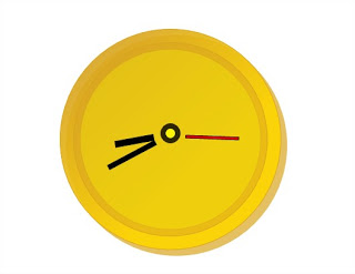
Finally! Our Analog clock is ready. Now you should refresh and see it.
HostForLIFE.eu Silverlight 6 Hosting
HostForLIFE.eu is European Windows Hosting Provider which focuses on Windows Platform only. We deliver on-demand hosting solutions including Shared hosting, Reseller Hosting, Cloud Hosting, Dedicated Servers, and IT as a Service for companies of all sizes. We have customers from around the globe, spread across every continent. We serve the hosting needs of the business and professional, government and nonprofit, entertainment and personal use market segments.