European Silverlight 4 & Silverlight 5 Hosting BLOG

BLOG about Silverlight 5 Hosting and Its Techologies - Dedicated to European Windows Hosting Customer

European Silverlight 5 Hosting - Amsterdam :: Telerik RadCoverFlow in SilverLight 5

clock December 20, 2013 06:18 by author Patrick

Today, in this article let's play around with another interesting concept of Telerik RadControls.

What is RadCoverFlow?
In simple terms "It enables to provide a rich GUI interface which navigates through a group of images.".

Step 1: The complete code of MainPage.xaml looks like this:

<UserControl x:Class="RadCoverApplication.MainPage"xmlns="http://schemas.microsoft.com/winfx/2006/xaml/presentation" xmlns:x="http://schemas.microsoft.com/winfx/2006/xaml"xmlns:d="http://schemas.microsoft.com/expression/blend/2008" xmlns:mc="http://schemas.openxmlformats.org/markup-compatibility/2006"xmlns:telerik="http://schemas.telerik.com/2008/xaml/presentation"mc:Ignorable="d" d:DesignWidth="640" d:DesignHeight="480">
    <Grid x:Name="LayoutRoot">
        <telerik:RadCoverFlow Margin="126,12,108,61" Name="radCoverFlow1" OffsetX="0"OffsetY="40"CameraViewpoint="Top"DistanceBetweenItems="20"DistanceFromSelectedItem="5"
RotationY="56"IsReflectionEnabled="True"ItemScale="0.60">
            <Image Source="pics/e6e22af6f3224593a6c658b3d3f7a1fd.jpg"  Width="400" Height="120"></Image>
            <Image Source="pics/Microsoft-.NET-logo-white.png"  Width="400" Height="120"></Image>
            <Image Source="pics/microsoft-windows-8.jpg" Width="400" Height="120"></Image>
            <Image Source="pics/microsoft (1).jpg"  Width="400" Height="120"></Image>
            <Image Source="pics/Microsoft.jpg"  Width="400" Height="120"></Image>
        </telerik:RadCoverFlow>
    </Grid>
</UserControl>


Step 2: The complete code of MainPage.xaml.cs looks like this:

using System;
using System.Collections.Generic;
using System.Linq;
using System.Net;
using System.Windows;
using System.Windows.Controls;
using System.Windows.Documents;
using System.Windows.Input;
using System.Windows.Media;
using System.Windows.Media.Animation;
using System.Windows.Shapes;
namespace RadCoverApplication
{
    public partial class MainPage : UserControl
    {
        public MainPage()
        {
            InitializeComponent();
        }
    }
}

Step 3: The output of the application looks like this:

Step 4: The output of the left moved pics application looks like this:

Step 5: The output of the right moved pics application looks like this:

Hope this article is useful!


European Silverlight 5 Hosting - Amsterdam :: Vector and Bitmap Printing for Reports in Silverlight 5

clock October 17, 2013 07:11 by author Scott

Printing Basics

Just as it was in Silverlight 4, Printing is centered around the PrintDocument class, found in System.Windows.Printing. This class has three primary events: BeginPrint, EndPrint, and PrintPage, which are your hooks into the printing system. You do setup in BeginPrint, teardown in EndPrint, and all the actual page production in PrintPage.

Page Markup

Here's the simple test page XAML I used for this printing example.

<Grid x:Name="LayoutRoot" Background="White">
    <Button Content="Print Bitmap"
            Height="23"
            HorizontalAlignment="Left"
            Margin="141,79,0,0"
            Name="PrintBitmap"
            VerticalAlignment="Top"
            Width="95"
            Click="PrintBitmap_Click" />
    <Button Content="Print Vector"
            Height="23"
            HorizontalAlignment="Left"
            Margin="141,108,0,0"
            Name="PrintVector"
            VerticalAlignment="Top"
            Width="95"
            Click="PrintVector_Click" />
    <Button Content="Force Vector"
            Height="23"
            HorizontalAlignment="Left"
            Margin="141,137,0,0"
            Name="PrintVectorForced
            VerticalAlignment="Top"
            Width="95"
            Click="PrintVectorForced_Click" />
</Grid>

The application UI looks really simple, just three buttons on a page. This is one of my finest designs.

Next, I'll wire up an event handler for each button, and use it to demonstrate the behavior of the three different printing approaches.

Page Code for Basic Vector Printing

Here's the code for a basic vector print of 30 rows.

// Tests basic (not forced) vector printing  
private void PrintVector_Click(object sender, RoutedEventArgs e)
{
    PrintDocument doc = new PrintDocument();

    doc.PrintPage += (s, ea) =>
        {
            StackPanel printPanel = new StackPanel();

            Random rnd = new Random();

            for (int i = 0; i < 30; i++)
            {                  
                TextBlock row = new TextBlock();
                row.Text = "This is row " + i + " of the current page being printed in vector mode.";                      

                printPanel.Children.Add(row);
            }

            ea.PageVisual = printPanel;
            ea.HasMorePages = false;
        };

    PrinterFallbackSettings settings = new PrinterFallbackSettings();

    doc.Print("Silverlight Vector Print");
}

Note that the PageVisual is assigned after the printPanel is populated. If you assign it prior, and do not force a recalculation of layout (in my example, the panel isn't in the visual tree, but layout is calculated with you assign PageVisual), you'll get a StackPanel with 30 items all piled on each other in the same row. The easiest way to fix this is to assign the PageVisual after the visual has all its children populated.

You could also point the PageVisual to an on-screen visual if you desire. If you're going to do that, you'll need to unhook the visual from the tree first, as a single element cannot have two parents.

If you have no more pages to print other than this one, set HasMorePages to false. If you have additional pages after this one, set it to true.

Printer Fallback Settings and Forcing Vector Printing Mode

New in Silverlight 5 is the PrinterFallbackSettings class. This class is used by one of the overloads of PrintDocument.Print to set two options: ForceVector and OpacityThreshold.

In the previous example, if you had any elements that had opacity other than 1.0, perspective transforms, or other things PostScript doesn't understand, Silverlight would silently fall back to bitmap-based printing.

ForceVector forces Silverlight to print in vector mode, assuming you have a PostScript-enabled printer driver, even when postscript-incompatible items exist in the element tree assigned to PageVisual. You use this in tandem with OpacityThreshold. The Opacity threshold sets the value over which Silverlight will treat an element's opacity as 1.0 to support PostScript printing.

// tests trying to force vector printing mode
private void PrintVectorForced_Click(object sender, RoutedEventArgs e)
{
    PrintDocument doc = new PrintDocument();

    doc.PrintPage += (s, ea) =>
    {
        StackPanel printPanel = new StackPanel();

        Random rnd = new Random();

        for (int i = 0; i < 30; i++)
        {
            TextBlock row = new TextBlock();
            row.Opacity = (rnd.Next(3, 10)) / 10.0;
            row.Text = "This is row " + i + " of the current page being printed. Opacity is " + row.Opacity;

            printPanel.Children.Add(row);
        }

        ea.PageVisual = printPanel;
        ea.HasMorePages = false;
    };

    PrinterFallbackSettings settings = new PrinterFallbackSettings();
    settings.ForceVector = true;
    settings.OpacityThreshold = 0.5;

    doc.Print("Silverlight Forced Vector Print", settings);
}

If your content or your printer doesn't support PostScript printing, Silverlight automatically falls back to sending an uncompressed bitmap to the printer. If your printer doesn't support PostScript, you'll see the effect of opacity in the printed results (some items lighter colored than others, for example) as the fallback bitmap mode supports opacity.

Printing in Bitmap Mode

Sometimes you know you want to print in bitmap mode. Rather than let vector mode fall back to bitmap, you can simply force bitmap printing from the start. If you have a PostScript compatible printer and driver, this is quite a bit faster than it was in Silverlight 4, as the bitmap is compressed. If you don't have a PostScript driver, it sends a plain old uncompressed bitmap just like Silverlight 4.

// tests printing in bitmap mode
private void PrintBitmap_Click(object sender, RoutedEventArgs e)
{
    PrintDocument doc = new PrintDocument();

    doc.PrintPage += (s, ea) =>
    {
        StackPanel printPanel = new StackPanel();

        Random rnd = new Random();

        for (int i = 0; i < 30; i++)
        {
            TextBlock row = new TextBlock();
            row.Opacity = (rnd.Next(3, 10)) / 10.0;
            row.Text = "This is row " + i + " of the current page being printed in bitmap mode. Opacity is " + row.Opacity;

            printPanel.Children.Add(row);
        }

        ea.PageVisual = printPanel;
        ea.HasMorePages = false;
    };

    doc.PrintBitmap("Silverlight Bitmap Print");
}

Bitmap mode will preserve the opacity settings, as well as ensure render transforms are printed (assuming you apply them) etc. It's not the best approach for printing a report, but it's the highest-fidelity approach for printing visuals when you want to do the equivalent of a print-screen.

The resolution of the bitmap sent is set to the selected printer resolution, typically 600dpi.

Efficient Printing

So, for the most efficient printing of multi-page reports, you'll want to make sure you do the following:

  • Have a PostScript-compatible printer with an appropriate PostScript driver (typically ends with " PS")
  • Avoid Opacity other than 1.0 in your elements to be printed (or use the appropriate fallback settings)
  • Leave out perspective transforms, 3d, and other things not compatible with PostScript printing.


European Silverlight 5 Hosting - Amsterdam :: ICustomTypeProvider in Silverlight 5

clock July 19, 2013 06:51 by author Scott

Why would I want to trick Silverlight into treating Dictionary values like real Properties?

There are scenarios when complex, data-intensive applications will need to data bind to keys/value pairs or generally determine the properties of a Class at runtime.  In cases where there could be large numbers of keys or the keys could change without an application re-deploy, this is a tricky problem to solve. 

In Silverlight 5, however, you can use ICustomTypeProvider to achieve the same goal in a clean fashion.

Data Facets

Some systems, such as Pivot Viewer, allow you to specify any number of pseudo-Properties about interesting items, which we’ll call Facets.  Using a structure like a Dictionary, we could specify any number of Facets.  Two-way data binding to these is problematic however since they aren’t real CLR properties.  In the full .NET Framework you can do tricks with ICustomTypeDescriptor, and now in Silverlight 5 we have System.Reflection.ICustomTypeProvider.
Let’s create a simple Facet class to represent data about the Facet we’d like to data bind to.

/// <summary>
/// Some facet of a dynamic type
/// </summary>
public class Facet
{
    /// <summary>
    /// Must be a valid CLR property name
    /// </summary>
    public string PropertyName { get; set; }

    public Type PropertyType { get; set; }

    //Couple of demo Facets

    public static Facet DynamicDemo0 = new Facet
    {
        PropertyName = "DynamicPropZero",
        PropertyType = typeof(string)
    };

    public static Facet DynamicDemo1 = new Facet
    {
        PropertyName = "DynamicPropOne",
        PropertyType = typeof(double)
    };
}

Next we’ll create an object with a regular CLR property and a dictionary to store key/value pairs.  These key value pairs will be made binding-friendly.

/// <summary>
/// An Class with normal properties, but also supporting dynamic properties
/// </summary>
public class FacetedObject : ICustomTypeProvider, INotifyPropertyChanged,
INotifyDataErrorInfo
{
    Dictionary<string, object> _facetValues;

    public object this[string key]
    {
        get
        {
            if (!_facetValues.ContainsKey(key))
            {
                return null;
            }
            return _facetValues[key];
        }
        set
        {
            _facetValues[key] = value;
            OnPropertyChanged(key);
        }
    }

The interesting thing here is the ICustomTypeProvider interface implementation. 

ICustomTypeProvider Implementation

On any CLR object you can call GetType().  If you’ve ever done any reflection programming you’re aware of all the rich runtime metadata about your classes that System.Type can provide.  System.Type is also an abstract class, and ICustomTypeProvider requires only a single method implementation:

public Type GetCustomType()
{
    return new FacetedObjectType<FacetedObject>(_currentFacets);
}

So, we can create a class that extends System.Type and do some interesting things.  We can trick the Silverlight runtime into thinking our Facets are real CLR Properties.  While my FacetObjectType<TSource> implementation is about 300 lines long, here’s the most interesting part:

/// <summary>
/// A custom System.Type implementation that can provide different Properties at runtime.
 All operations except those related to
/// Property logic delegated to the type of TSource
/// </summary>
/// <typeparam name="TSource"></typeparam>
public class FacetedObjectType<TSource> : System.Type
{
//snip…


    public override System.Reflection.PropertyInfo[] GetProperties(BindingFlags bindingAttr)
    {
        var properties = ProxyTargetType.GetProperties(bindingAttr);

        if (
           BindingFlags.Instance == (bindingAttr & BindingFlags.Instance)
        && BindingFlags.Public == (bindingAttr & BindingFlags.Public)
        )
        {
            var dynamicProperties = GetPublicDynamicProperties();
            var allprops = new List<PropertyInfo>();
            allprops.AddRange(properties);
            allprops.AddRange(dynamicProperties);
            return allprops.ToArray();
        }
        return properties;
    }
//snip…

So, for system types that implement ICustomTypeProvider, we can intercept important requests for reflection information and supplement that information.  In our case here, we can claim that properties exist that aren’t really on our class at compile time.  In terms of telling the runtime how to actually Get and Set these dynamic properties, we need to create a class that extends PropertyInfo.  Here’s a type called DynamicPropertyInfo, and the two most interesting methods:

public class DynamicPropertyInfo : PropertyInfo
{
    public DynamicPropertyInfo(Type propertyType, Type declaringType, string propertyName)
    {
        _propertyType = propertyType;
        _declaringType = declaringType;
        _name = propertyName;
    }

    public override object GetValue(object obj, BindingFlags invokeAttr, Binder binder,
        object[] index, System.Globalization.CultureInfo culture
    {
        var fo = obj as FacetedObject;
        return fo[Name];
    }

    public override void SetValue(object obj, object value, BindingFlags invokeAttr, Binder binder,
        object[] index, System.Globalization.CultureInfo culture)
    {
        var fo = obj as FacetedObject;
        fo[Name] = value;
    }

In here, we can just use the this[] indexer of our FacetedObject class to get and set values.

Demo App

To show how this concept works, let’s create a Silverlight 5 application with a DataGrid.  We’re going to get the datagrid to display “properties” that technically speaking are not there.  First we’ll create a couple of Facets assigned to FacetedObject by default called “DynamicPropZero” and “DynamicPropOne”.  For these two we can create DataGridColumns along with an actual compile-time Property of FacetedObject.

            <sdk:DataGrid.Columns>
                <
sdk:DataGridTextColumn Header="Id" IsReadOnly="True" Binding="{Binding Id}" />
                <
sdk:DataGridTemplateColumn Header="Dynamic Property 0">
                    <
sdk:DataGridTemplateColumn.CellTemplate>
                        <
DataTemplate>
                            <
TextBox Text="{Binding DynamicPropZero, Mode=TwoWay,
                               
NotifyOnValidationError=True,
                               
ValidatesOnNotifyDataErrors=True,                              ValidatesOnDataErrors=True,ValidatesOnExceptions=True}"/>
                        </
DataTemplate>
                    </
sdk:DataGridTemplateColumn.CellTemplate>
                </
sdk:DataGridTemplateColumn>
                <
sdk:DataGridTextColumn Header="Dynamic Property 1"
                                       
Binding="{Binding DynamicPropOne, Mode=TwoWay}" />
            </
sdk:DataGrid.Columns>

Here’s the code we’re using to create the sample data in our main ViewModel.  Note that we're going to explose the dictionary values as properties.

public class ShellViewModel : INotifyPropertyChanged
{
    public ShellViewModel()
    {
        Items = new ObservableCollection<FacetedObject>();
        var d0 = new FacetedObject();
        d0[Facet.DynamicDemo0.PropertyName] = "I'm a property!";
        d0[Facet.DynamicDemo1.PropertyName] = 42.42;

        var d1 = new FacetedObject();
        d1[Facet.DynamicDemo0.PropertyName] = "Would you like to be a property too?";
        Items.Add(d0);
        Items.Add(d1);

And as you can see, it works:

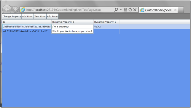
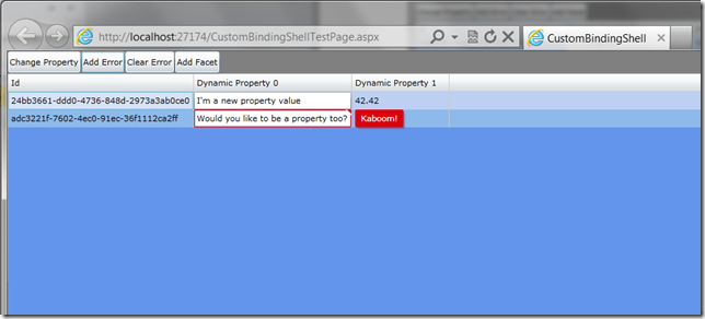
Notice the buttons above the DataGrid.  These dynamic properties wouldn’t be very useful unless they are first-class citizens, and they are.  Note that FacetedObject also implements INotifyPropertyChanged and INotifyDataErrorInfo.  By clicking the buttons we fire commands that affect changes in code, and the UI reflects the changes for the dynamic properties.

Now, recall at the beginning that I said this could be completely dynamic and that we could actually create both the Facet data and visuals in a data driven fashion at runtime.  Clicking on the Add Facet button demonstrates this.

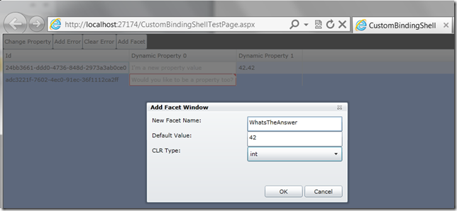
After clicking OK, we can do some work to add this Fact to the items on the ViewModel, and also dynamically create a new DataGridColumn to display the data.

public void AddNewFacet(string name, object defaultValue, string clrType)
{
    var typeDict = new Dictionary<string, Type>();
    typeDict["string"] = typeof(string);
    typeDict["int"] = typeof(int);
    typeDict["double"] = typeof(double);

    //1. Create a new Facet
    var newFacet = new Facet
    {
        PropertyName = name,
        PropertyType = typeDict[clrType]
    };

    //2. Tell objects to clear out cached state
    //3. Assign a default value we can see in the UI
    var vm = DataContext as ShellViewModel;   

    foreach (var item in vm.Items)
    {
        item.AddFacet(newFacet);
        item[newFacet.PropertyName] = defaultValue;
    }

    //4. create visuals to bind to new facet
    var sb = new StringBuilder("<DataTemplate
xmlns=\"http://schemas.microsoft.com/winfx/2006/xaml/presentation\" >")
    .Append("<TextBox Text=\"{Binding  ")
    .Append(name)
    .Append(", Mode=TwoWay}\" />")
    .Append("</DataTemplate>");

    var dt = (DataTemplate)XamlReader.Load(sb.ToString());
    var column = new DataGridTemplateColumn();
    column.Header = name;
    column.CellTemplate = dt;
    FacetGrid.Columns.Add(column);
}

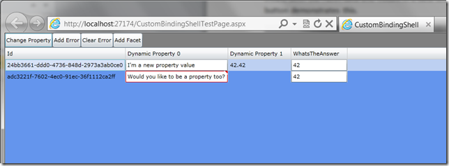
Our new DynamicProperty is now shown in the DataGrid and we can edit it with two-way binding support:

For some, this last piece of code will look like the worst kind of voodoo, but there are cases where your requirements will dictate this level of flexibility and this combination of techniques will help you get there.


European Silverlight 5 Hosting - Amsterdam :: Animation in Silverlight 5 Using VisualStateManager.LoadTransition

clock July 5, 2013 06:24 by author Scott

I was quite happy to see the all those sleek new additions to silverlight 5. I will be addressing all of them one by one. For the timebeing i will show how to give that nice and smooth initial animation when a control is loading. Before silverlight 5, this was pretty time consuming as you required to write all those custom animation codes and have their triggers in place. Now all you need to do is the following :

<Grid>
<VisualStateManager.LoadTransition>
<LoadTransition StartXOffset="300" GeneratedDuration="0:0:1.0" StartOpacity="0.2">
<LoadTransition.GeneratedEasingFunction>
<CircleEase/>
</LoadTransition.GeneratedEasingFunction>
</LoadTransition>
</VisualStateManager.LoadTransition>
</Grid>

As we can see above, its a very simple usage. All we need to do is add the VisualStateManager.LoadTransition to our Grid. The parameters are quite self explanatory :

  • StartXOffset : The intial x co-ordinate from which to start the transition
  • GeneratedDuration : The amount of time it would animate
  • StartOpacity : The initial Opacity. Here it start with an initial opacity of 20%
  • Also notice that we have added an easing function of type CircleEase. (More details on it at : http://msdn.microsoft.com/en-us/library/ee308751.aspx)


European Silverlight 5 Hosting - Amsterdam :: Using MVVM to Show Busy Indicator in Silverlight

clock February 25, 2013 05:05 by author Scott

Introduction

When using Silverlight, everything is asynchronous. It seems to be the trend, the same goes for Windows 8. This means that you will need to inform the user about progress in the background.

Silverlight uses the BusyIndicator for this behavior. Using MVVM, it might be a bit harder to implement the BusyIndicator in a correct way, but Catel provides the IPleaseWaitService for years which can be mocked easily during test scenarios.

However, it didn’t support a busy indicator per view yet. This fact has changed today, as you can see in the screenshot below:

A long requested feature in Catel was the support for tags in the ServiceLocator. The ServiceLocator is the IoC solution that Catel provides by default. A customer of Catel recently required the busy indicators to show up per view. I thought a bit about it and this could be solved by the recently (read: this week) introduction of the tags in the ServiceLocator.

Setting up the views

The view is responsible for registering the service. This can easily be done using the Catel user controls. Create a view like you always do, then use the following code-behind:

   1:  protected override void OnViewModelChanged()
   2:  {
   3:      var serviceLocator = ServiceLocator.Default;
   4:  
   5:      var viewModel = ViewModel;
   6:      if (viewModel != null)
   7:      {
   8:          serviceLocator.RegisterInstance(typeof (IPleaseWaitService), new PleaseWaitService(this), viewModel);
   9:      }
  10:  }

This code will be executed when the ViewModel property of the control changes. The view registers a view specific instance of the PleaseWaitService service in the ServiceLocator. It uses the new view model as tag so that will be used to distinguish the services.

Setting up the view models

The view model can retrieve the PleaseWaitService very easily because the tag is itself. To show the view specific please wait service, use this code:

   1:  var pleaseWaitService = GetService<IPleaseWaitService>(this);
   2:  pleaseWaitService.Show();

To hide the window again, use this code:

   1:  var pleaseWaitService = GetService<IPleaseWaitService>(this);
   2:  pleaseWaitService.Hide();

Customizing the PleaseWaitService

Customizing the please wait service is very, very easy. Just override the class like this:

   1:  public class MyCustomPleaseWaitService : PleaseWaitService
   2:  {
   3:      protected override FrameworkElement CreateBusyIndicator()
   4:      {
   5:          var busyIndicator = new MyBusyIndicatorControl();
   6:          
   7:          busyIndicator.SetBinding(System.Windows.Controls.BusyIndicator.BusyContentProperty, new Binding("Status"));
   8:          busyIndicator.SetBinding(System.Windows.Controls.BusyIndicator.IsBusyProperty, new Binding("IsBusy"));
   9:          
  10:          return busyIndicator();
  11:      }
  12:  }

The base implementation will automatically take care that the data context is updated and that the control is centered as required.


European Silverlight Hosting - Amsterdam :: How to Enable Dynamic Compression in IIS 7/7.5

clock February 18, 2013 07:47 by author Scott

In this tutorial I will show you how to enable dynamic compression in IIS 7. For other post of dynamic compression, please just see our last post.

You’ll see this error message when you haven’t setup dynamic compression on your IIS:

“The dynamic content compression module is not installed.”

Ok, let’s start the tutorial:

1. Open server manager

2. Roles --> IIS

3. Role Services (scroll down) --> Add Role Services

4. Add desired role (Web Server --> Performance > Dynamic Content Compression)

5. Wait till finish.

To enable this feature, here are the steps:

1. Open server manager

2. Roles --> Web Server (IIS) --> Internet Information Services (IIS) Manager

3. Then, go to your site --> your website

4. IISà compression

And dynamic compression has been enable on your server. Hope this tutorial is interesting.


European Silverlight Hosting - Amsterdam :: Silverlight FluentDataGrid

clock January 24, 2013 07:14 by author Scott

Almost every application to work with the data we have to work with the tables for display to the user of any data which it has applied. For users familiar applications such pages and comfortable enough, but not always easy to implement a particular display logic for complex data structures such as the customer wants them to be. We give a simple example, let us have the lists A and B, are related by 1: n, each element of the list B contains three attributes - the key, the record type and value, types of records that can be repeated. Suppose we want to display the record of A, so that each row of A list displays all values ​​from the list B, the record type is used as a title 

Students (List A) 

Id

Name

1

John

2

Alex

3

Sara

Marks (List B) 

Id

Student

Category

Value

1

1

C#

5

2

1

Java

3

1

HTML & CSS

4

4

2

C#

4

5

3

Java

3

We need to get the following table:

Id

Name

Marks

C#

Java

HTML & CSS

1

John

5

4

4

2

Alex

4

-

-

3

Sara

-

3

-

Application in which I faced with such a task was developed using the technology of Silverlight. Built-in DataGrid functionality described above is not realized. This led to the development of special control FluentGrid. 

How it works:

FluentDataGrid - is the control that builds a table based on a custom data source FluentGridSource. Currently, the construction of the table (view) is available only at runtime. FluentGridSource has Fluent-like interface for the formation of rules of construction.

The key source of data is the formation of the class, which will be a "model line." She describes one row of the result table, for our example of such a class might look like:

public class ExampleRow : PropertyChangedBase
{
    public ExampleRow(int id, string name, IList<IDynamicElement> marks)
    {
        _id = id;
        _name = name;
        Marks = marks;
    }

    private int _id;
    private string _name;

    [DynamicHeader("Id", false, HorizontalAlignment = HorizontalAlignment.Right)]
    public int Id
    {
        get { return _id; }
        set
        {
            NotifyPropertyChanged(() => Id);
            _id = value;
        }
    }

    [DynamicHeader("Name", false,
        HorizontalAlignment = HorizontalAlignment.Left, Width = 200)]
    public string Name
    {
        get { return _name; }
        set
        {
            NotifyPropertyChanged(() => Name);
            _name = value;
        }
    }

    public IList<IDynamicElement> Marks { get; set; }
}

public class MarkDynamicElement : PropertyChangedBase, IdynamicElement
{
    private object _value;

    public MarkDynamicElement(DynamicHeader header, object value)
    {
        Header = header;
        Value = value;
    }

    /// <summary>
    /// Header for the value
    /// </summary>
    public DynamicHeader Header { get; set; }

    /// <summary>
    /// Value that will be displayed
    /// </summary>
    public object Value
    {
        get { return _value; }
        set
        {
            _value = value;
            NotifyPropertyChanged(() => Value);
        }
    }
}

The base class implements the INotifyPropertyChanged PropertyChangedBase. We see that in the line two "static" column Id and Name, attribute DynamicHeader helps us set a cap column. There is also a list of Marks, a "dynamic" of the table, which can be constructed, for example, by using LINQ. Its elements have to implement a special interface IDynamicElement.

In forming a data source, you can add formatting rules AddFromatter (), totals AddSummary (), validation rules for totals AddValidator (), the validation rules of values ​​in table cells AddCellValidator (), and set rules for the formation of the hierarchy. In order to specify the hierarchy, you must specify the property model - key (Id), the property - a reference to the parent element (ParentId) and the property on which to display the hierarchy. 

How to use:  

The first step is defining the control in the XAML file:  

<CurriculumControl Source="{Binding SimpleSampleSource,Mode=TwoWay}" SelectedItem="{Binding SelectedRow, Mode=TwoWay}" /> 

Next step is to create a row with the appropriate attributes for the grid as described above. 

Than you should create view model, construct FluentGridSource

DynamicExampleSource = FluentGridSource.CreateFrom(DynamicExampleSource, Repository.GetExampleRows());
Constructing FluentGrisSource may be more complex if you set some validation, totals
ValidationSampleSource = new FluentGridSource(typeof(SimpleRow));
ValidationSampleSource = FluentGridSource.CreateFrom(ValidationSampleSource, Repository.GetSimpleRows());

#region Formatters

ValidationSampleSource
    .SetOptions(true, 50)
    .AddFormatter(new DynamicHeader {Name = "Min", HeaderGroup = new OverallSalaryHeaderGroup()},
                  (row, value) => ((double) value).ToString("c", new CultureInfo("en-us")));
#endregion

#region Summaries
ValidationSampleSource
    .AddSummary(new DynamicHeaderCollection {new DynamicHeader {Name = "Employee name"}}, x => "Total")
    .AddSummary(
        new DynamicHeaderCollection
            {new DynamicHeader {Name = "Min", HeaderGroup = new OverallSalaryHeaderGroup()}},
        delegate(IDictionary<DynamicHeader, IEnumerable> allValues)
            {
                var header = allValues.Keys.Single(x => x.Name == "Min");
                var values = (List<object>) allValues[header];
                return values.Sum(x => (double) x);
            })
    .AddSummary(
        new DynamicHeaderCollection
            {new DynamicHeader {Name = "Max", HeaderGroup = new OverallSalaryHeaderGroup()}},
        delegate(IDictionary<DynamicHeader, IEnumerable> allValues)
            {
                var header = allValues.Keys.Single(x => x.Name == "Max");
                var values = (List<object>) allValues[header];
                return values.Sum(x => (double) x);
            });
#endregion

#region Validations

ValidationSampleSource
    .AddCellValidator(new DynamicHeader { Name = "Min", HeaderGroup = new OverallSalaryHeaderGroup() },
        delegate(object row, object value)
        {
            var simpleRow = (SimpleRow)row;
            var min = (double)value;

            if (min > simpleRow.Max)
                return "Minimum cannot be higher than maximum!";
            if (min < 5000)
                return "Minimum cannot be lower than $5000";

            return null;
        })
    .AddCellValidator(new DynamicHeader { Name = "Max", HeaderGroup = new OverallSalaryHeaderGroup() },
        delegate(object row, object value)
        {
            var simpleRow = (SimpleRow)row;
            var max = (double)value;

            if (max < simpleRow.Min)
                return "Maximum cannot be lower than minimum!";
            if (max > 500000)
                return "Maximum cannot be heigher than $500000";

            return null;
        });

#endregion


European Silverlight 5 Hosting - Amsterdam :: Working with Observable Collections in Silverlight 5

clock November 15, 2012 09:49 by author Scott

Observable Collections are great to preserve the latest data in data controls without having to rebind data to the data controls. In this article we will explore how we can work with Observable Collections in Silverlight 5.

Silverlight – A Quick Look

Silverlight is a browser plug-in that promotes a collaborative development environment of rich online media content that enables developers and designers alike to integrate multimedia and graphics into web pages within the context of the managed environment. Over the past few years, Silverlight, formerly known as Windows Presentation Foundation Everywhere (WPF/E), has become popular worldwide for developing the next generation of cross-browser, cross-platform Rich Internet Applications (RIAs).

Observable Collections

The generic List<T> represents a strongly typed list of elements or a CLR or non-CLR type. When we bind data to a DataControl in ASP.NET using such a list, the data in the data bound control is up to date with the data in the list. However, when the data in the list changes, the data control has to be re-bound to reflect the changes. In other words, we have to rebind the data in the list (now the list contains updated data) to reflect the change. This problem is solved in using ObservableCollection<T>. This collection is capable of providing notifications of items added/deleted/edited through the INotifyCollectionChanged interface. The INotifyCollectionChanged interface has an event called PropertyChanged, which is fired when a property value is changed.

ObservableCollection is a generic dynamic data structure that has the ability to send notifications when items are added, removed or when the collection is refreshed. The MSDN states: "Represents a dynamic data collection that provides notifications when items get added, removed, or when the whole list is refreshed." Reference: http://msdn.microsoft.com/en-us/library/ms668604.aspx

The ObservableCollection class is shown below:

[SerializableAttribute]
public class ObservableCollection<T> : Collection<T>,
            INotifyCollectionChanged, INotifyPropertyChanged


You can instantiate an Observable collection as shown in the code snippet below:

using System.Collections.ObjectModel;
ObservableCollection<Product> products = new ObservableCollection<Product>();

Consider the following class:

public class Contact
    {
        private string firstName;
        private string lastName;
        private string address; 

        public Contact(string firstName, string lastName, string address)
        {
            this.firstName = firstName;
            this.lastName = lastName;
            this.address = address;
        } 

        public string FirstName
        {
            get { return firstName; }
            set { firstName = value; }
        } 

        public string LastName
        {
            get { return lastName; }
            set { lastName = value; }
        } 

        public string Address
        {
            get { return address; }
            set { address = value; }
        }
    }

The following class creates an Observable Collection out of the Contact class:

public class EmployeeList : ObservableCollection<Contact>
    {
        public EmployeeList()
            : base()
        {
            Add(new Contact("Joydip", "Kanjilal", "Hyderabad"));
            Add(new Contact("Debanjan", "Banerjee", "Kolkata"));
            Add(new Contact("Shaik", "Tajuddin","Hyderabad"));
            Add(new Contact("Firdous", "Khan", "Hyderabad"));
        }
    }

You can now use the Observable Collection you have created to bind data to a Silverlight Data Grid. Here is how the mark-up code would look:

<Grid x:Name="LayoutRoot" Background="White">
        <sdk:DataGrid x:Name="dgData" Grid.Row="2" AutoGenerateColumns="True"  ItemsSource="{Binding Source}" >

        </sdk:DataGrid>
    </Grid>

And, here's the code you would write to bind data to the DataGrid control named dgData:

public partial class MainPage : UserControl
    {
        EmployeeList empList = new EmployeeList();

        public MainPage()
        {
            InitializeComponent();          

            dgData.ItemsSource = empList;

        }
    }

To ensure that the DataGrid is refreshed if any item in the collection is changed, we should take advantage of the PropertyChangedEventHandler event handler. The NotifyPropertyChange event handler would be automatically called whenever the list is changed.

public partial class MainPage : UserControl
    {
        EmployeeList empList = new EmployeeList();

        public MainPage()
        {
            InitializeComponent();          
            dgData.ItemsSource = empList;

        }

        public EmployeeList Data
        {

            get { return empList; }

            set
            {

                empList = value;

                NotifyPropertyChange("empList");

            }

        }

        public event PropertyChangedEventHandler PropertyChanged;

        protected void NotifyPropertyChange(string propertyName)
        {

            if (PropertyChanged != null)
                PropertyChanged(this, new PropertyChangedEventArgs(propertyName));

        }
    }

Summary

In this article we discussed how we can work with Observable Collections in Silverlight 5. We explored Observable Collections, why they are helpful and how we can bind data to data controls in Silverlight using Observable Collections. Happy reading!


European Silverlight 5 Hosting - Amsterdam :: Markup Extensions in Silverlight 5

clock September 28, 2012 09:03 by author Scott

Another cool feature available in Silverlight 5 is markup extensions. The idea behind the feature is ability to allow developers to supply values to XAML parser at the time it parses visual tree. In other words, once parser finds a markup extension in XAML, it will create an instance of it, set any properties that the extension might have, then call ProvideValue method that will return a value of the type that the property that markup extension supports expects. For example, I am writing a markup extension to supply an ICommand to the button, my XAML would looks like the following:

      <Button Content="Save" HorizontalAlignment="Left"  
             Grid.Row="4" Grid.Column="0"
             Command="{ext:CommandMarkupExtension
                 ViewModel={Binding ElementName=LayoutRoot, Path=DataContext},
                 ExecuteMethodName=Run,
                 CanExecuteMethodName=CanRun}"/>


So, in this example for markup extension I am writing a command extension. As you can see in the XAML above, my extension takes three parameters: ViewModel to invoke, execute and can execute method names. This way I can de-clutter my view model by removing all the command instantiation code, and just write the two methods I need. The code in this extension is very easy – just a handful of dependency properties and interface implementation for IMarkupExtension:

using System;

using System.Windows;

using System.Windows.Input;

using System.Xaml;


namespace SL5Features.Extensions

{

  public class CommandMarkupExtension : FrameworkElement, IMarkupExtension<ICommand>
  {

    public Object ViewModel
    {
      get { return (Object)GetValue(ViewModelProperty); }
      set { SetValue(ViewModelProperty, value); }
    }

    public static readonly DependencyProperty ViewModelProperty =
        DependencyProperty.Register(
        "ViewModel", typeof(Object),
        typeof(CommandMarkupExtension),
        new PropertyMetadata(null));

    public string ExecuteMethodName
    {
      get { return (string)GetValue(ExecuteMethodNameProperty); }
      set { SetValue(ExecuteMethodNameProperty, value); }
    }
    public static readonly DependencyProperty ExecuteMethodNameProperty =
        DependencyProperty.Register(
        "ExecuteMethodName",
        typeof(string),
        typeof(CommandMarkupExtension),
        new PropertyMetadata(null));


    public string CanExecuteMethodName
    {
      get { return (string)GetValue(CanExecuteMethodNameProperty); }
      set { SetValue(CanExecuteMethodNameProperty, value); }
    }

    public static readonly DependencyProperty CanExecuteMethodNameProperty =
        DependencyProperty.Register(
        "CanExecuteMethodName",
        typeof(string),
        typeof(CommandMarkupExtension),
        new PropertyMetadata(null));

    public ICommand ProvideValue(IServiceProvider serviceProvider)
    {
      ReflectionCommand command =
        new ReflectionCommand(ViewModel, ExecuteMethodName, CanExecuteMethodName);
      return command;
    }
  }
}

To support the extension I need to write a command object that would actually implement ICommand. This class is pretty trivial, so I am not commenting it much:


using System;

using System.Reflection;

using System.Windows;

using System.Windows.Input;  


namespace SL5Features.Extensions

{

  public class ReflectionCommand : ICommand
  {

    private MethodInfo canExecuteMethod = null;
    private MethodInfo executeMethod = null;
    private object viewModel = null;

    private ReflectionCommand() {


    public ReflectionCommand(
      object viewModel,
      string executeMethodName,
      string canExecuteMethodName)
    {
      this.viewModel = viewModel;
      Type type = viewModel.GetType();
      if (!string.IsNullOrEmpty(canExecuteMethodName))
      {
        this.canExecuteMethod = type.GetMethod(canExecuteMethodName);
      }
      this.executeMethod = type.GetMethod(executeMethodName);
    }

    public void Execute(object parameter)
    {
      executeMethod.Invoke(viewModel, new[] { parameter });
    }

    public bool CanExecute(object parameter)
    {
      if (viewModel != null && canExecuteMethod != null)
      {
        return (bool)canExecuteMethod.Invoke(viewModel, new[] { parameter });
      }
      else
      {
        return true;
      }
    }


    public event EventHandler CanExecuteChanged;

    public void RaiseCanExecuteChanged()
    {
      if (CanExecuteChanged != null)
      {
        CanExecuteChanged(this, EventArgs.Empty);
      }
    }

  }
}

So, far it is pretty easy. Now, all I have to do is add Run and CanRun method on my view model that my command will invoke:

using SL5Features.Models;
using System.Windows;

namespace SL5Features.ViewModels

{
  public class PersonViewModel : ViewModelBase<Person
  {
    public PersonViewModel()
    {
      Model = new Person() { FirstName = "Sergey", LastName = "Barskiy" };
    }

    public void Run(object parameter)
    {
      MessageBox.Show("Run")
    }
    public bool CanRun(object parameter
    {
      return true;
    }
  }
}


Hopefully, I demonstrated the power of markup extension for you. The goal of using them to me is reduction of the amount of code elsewhere in the system, since you will obviously have to write more XAML. Of course, I am sure Blend 5 will support mark up extensions, so potentially you can just drag my extension on top of the button and setup a few properties in properties window. You will also see a number of demos where an extension is used to support localization, which seems pretty intuitive use of the feature. Bottom line is: I love getting new features that make my job easier by allowing me to write less code and re-use more of the code written.


European Silverlight 5 Hosting - Amsterdam :: Creating a Silverlight 5 Static Markup Extension

clock August 28, 2012 10:00 by author Scott

If you have done any WPF application development I am sure you have used and fallen in love with the Static markup extension. If you’re are not familiar with it, the Static markup extension allows you to reference static fields and properties in your XAML markup.

For example; let’s assume we have a class with the following static field defined:


public class Common

 {
     public static string StaticText = "This is text from a static property";
 }

We can use this field in our WPF application as follows:

<Grid>

     <TextBlock Text="{x:Static ext:Common.StaticText}" />
 </Grid>


NOTE: “ext” is a namespace that has been defined to instruct the XAML parser where to find our static field.

Pretty cool right? Unfortunately if you are also doing any Silverlight development you will soon find that this wonderful and useful extension does NOT exist in Silverlight. Luckily for us in Silverlight 5 we were given the ability to write our own custom markup extensions. This can be done using either the
IMarkupExtension or the abstract MarkupExtension class.

Now it’s time to create our own Static markup extension. I want to point out that there is a naming convention when creating custom markup extensions. The convention is as follows; ExtensionNameExtension. The name of the extension is followed by Extension. This is very similar to how you create attributes. You won’t actually be using the suffix when define them in XAML.

Let’s start by creating a new class called StaticExtension. The StaticExtension class should derive from the MarkupExtension abstract class. You will need to implement the abstract ProvideValue method. The code I used for the Static markup extension is as follows.

/// <summary>
 ///  Class for Xaml markup extension for static field and property references.
 /// </summary>
public class StaticExtension : MarkupExtension
 {
     /// <summary>
     ///  The static field or property represented by a string.  This string is
     ///  of the format Prefix:ClassName.FieldOrPropertyName.  The Prefix is
    ///  optional, and refers to the XML prefix in a Xaml file.
     /// </summary>
    private string _member;
     public string Member
     {
         get { return _member; }
         set
         {
             if (value == null)
             {
                 throw new ArgumentNullException("Member");
             }
             _member = value;
         }
     }

    /// <summary>
     ///  Return an object that should be set on the targetObject's targetProperty
    ///  for this markup extension.  For a StaticExtension this is a static field
    ///  or property value.
     /// </summary>
    /// <param name="serviceProvider">Object that can provide services for the markup extension.
     /// <returns>
     ///  The object to set on this property.
     /// </returns>
    public override object ProvideValue(IServiceProvider serviceProvider)
     {
         if (_member == null)
             throw new InvalidOperationException("member cannot be null");

        // Validate the _member
        int dotIndex = _member.IndexOf('.');
         if (dotIndex < 0)
             throw new ArgumentException("dotIndex");

        // Pull out the type substring (this will include any XML prefix, e.g. "av:Button")
        string typeString = _member.Substring(0, dotIndex);
         if (typeString == string.Empty)
             throw new ArgumentException("typeString");

        // Get the IXamlTypeResolver from the service provider
         IXamlTypeResolver xamlTypeResolver = serviceProvider.GetService(typeof(IXamlTypeResolver)) as IXamlTypeResolver;
         if (xamlTypeResolver == null)
             throw new ArgumentException("xamlTypeResolver");

        // Use the type resolver to get a Type instance
        Type type = xamlTypeResolver.Resolve(typeString);

        // Get the member name substring
         string fieldString = _member.Substring(dotIndex + 1, _member.Length – dotIndex – 1);
         if (fieldString == string.Empty)
             throw new ArgumentException("fieldString");

        // Use the built-in parser for enum types
         if (type.IsEnum)
         {
             return Enum.Parse(type, fieldString, true);
         }

        // For other types, reflect
        bool found = false;
         object value = null;

        object fieldOrProp = type.GetField(fieldString, BindingFlags.Public |                                                         BindingFlags.FlattenHierarchy | BindingFlags.Static);
         if (fieldOrProp == null)
         {
             fieldOrProp = type.GetProperty(fieldString, BindingFlags.Public
|                                                         BindingFlags.FlattenHierarchy | BindingFlags.Static);
             if (fieldOrProp is PropertyInfo)
             {
                 value = ((PropertyInfo)fieldOrProp).GetValue(null, null);
                 found = true;
             }
         }
         else if (fieldOrProp is FieldInfo)
         {
             value = ((FieldInfo)fieldOrProp).GetValue(null);
             found = true;
         }

        if (found)
             return value;
         else
             throw new ArgumentException("not found");
     }
 }

Now all I need to do is add a namespace to my Silverlight view and then use it in XAML as follows:

<Grid x:Name="LayoutRoot" Background="White">

     <TextBlock Text="{ext:Static Member=ext:Common.StaticText}" />
 </Grid>


That’s it! I will definitely be using this quite often. I would like to mention that unlike in WPF where you don’t have to specify the “Member” property explicitly, in Silveright you have to explicitly set the Member property. This is because there is not a
ConstructorArgument attribute in Silverlight. So until then you will need to have a little extra text in your markup syntax.


About HostForLIFE.eu

HostForLIFE.eu is European Windows Hosting Provider which focuses on Windows Platform only. We deliver on-demand hosting solutions including Shared hosting, Reseller Hosting, Cloud Hosting, Dedicated Servers, and IT as a Service for companies of all sizes.

We have offered the latest Windows 2016 Hosting, ASP.NET Core 2.2.1 Hosting, ASP.NET MVC 6 Hosting and SQL 2017 Hosting.


Tag cloud

Sign in